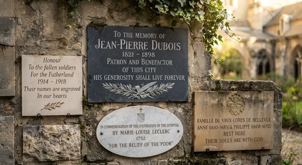
Memorial lettering gives a stone its visual voice: the same tribute wording can feel formal, intimate, or contemporary depending on its typography and engraving. Choosing a style involves more than appearance; stone color, inscription size, carving method, and viewing distance all affect legibility. By considering these elements together, families can create a personalized memorial that feels true to the person being remembered and remains clear over time.
Choosing Font Styles for a Personalized Memorial
Start by considering the tone of the tribute and the words it needs to carry. Classic serif letters offer a traditional, formal appearance and are often easy to read from a distance, while sans-serif lettering feels clean and understated. Script can add warmth to a name or short phrase, but its flourishes may be difficult to read when used for long inscriptions.
Typography should also work with the stone’s shape, finish, and color. A simple design may suit a contemporary garden setting, while more traditional lettering can complement a formal upright monument. A memorial specialist can help assess font samples at the actual size planned for the stone.
Selecting Lettering to Match the Tribute
Choose the font in relation to the inscription design, not in isolation. A long passage generally benefits from straightforward letterforms, whereas a brief name or line of tribute wording can accommodate more decorative script. Pairing a distinctive style for a name with a simpler secondary font can create a personal effect without sacrificing clarity.
Granite texture and color also influence the result: small or condensed letters may be hard to distinguish on a coarse-grained surface. Reviewing a full-size layout helps reveal spacing issues before engraving begins.
Comparing Stone Engraving Methods and Lettering
Font choice is only part of the decision; the engraving method determines how letters interact with the stone. Some techniques leave a shallow, light mark, while others create deeper grooves or raised forms that catch light and shadow. The right approach depends on the desired appearance, the memorial’s location, and the level of detail in the design.
Common methods differ in depth, finish, and suitability for fine details. The table summarizes their general characteristics; availability and results can vary by stone and memorial provider.
| Method | Appearance | Consideration |
|---|---|---|
| Laser engraving | Flat, pale lettering with fine detail | Useful for small text or intricate designs |
| Skin-traced sandblasting | Shallow, bright lettering | Creates a slightly deeper mark than laser engraving |
| V-sunk or V-tooled | Deeper letters with defined edges | Natural shadows can support readability |
| Square-sunk | Bright letters framed by a recessed background | Often selected for larger names or family names |
| Raised lettering | Letters stand above a textured background | Usually better suited to upright stones than lawn-level markers |
Balancing Detail, Durability, and Legibility
V-sunk lettering creates pronounced grooves that can remain visually distinct through natural shading. Laser engraving reproduces fine details, including delicate artwork, but its flatter appearance differs from deeper carved methods. Raised letters add dimension, though their exposed form may be more vulnerable to contact from groundskeeping equipment on flat memorials.
Consider the inscription’s size and viewing conditions before settling on a technique. A memorial specialist can explain how a chosen font will translate to a particular granite and whether its smallest details will remain clear.
Planning a Clear and Personal Inscription Design
A coherent memorial design brings together lettering, layout, wording, and stone finish. The name often serves as the visual anchor, with dates and additional text arranged around it. Restraint can make each element easier to appreciate: too many styles or tightly packed lines can compete with the message.
Before approving the design, review how its parts work together. These checks help keep personalization expressive while preserving legibility:
- Match decorative lettering to short text, and use simpler fonts for longer passages.
- Check that letter size and spacing suit the stone’s dimensions and surface.
- Compare the proposed lettering against the granite color and finish.
- Confirm that the engraving method can reproduce any fine details in the design.
Reviewing the Layout Before Engraving
A digital mockup or lettering sample can reveal crowded spacing, weak contrast, or a mismatch between the font and the memorial’s shape. It also allows families to assess the entire inscription rather than judging individual letters in isolation. This review is especially useful when combining a script name with a secondary typeface.
Thoughtful memorial lettering balances personal meaning with practical readability. For guidance tailored to the stone, wording, and engraving method, consult an experienced memorial professional before approving the final design.